
How to Create a Colour Palette for Your Squarespace Website
Your colour palette is one of the most important parts of your brand’s visual identity. It sets the tone, adds personality, and creates consistency across your website, social media, and marketing materials. On Squarespace, your colour palette directly affects everything from button styles to background sections—so it’s worth getting right.
Here’s how I recommend building a colour palette that works beautifully in Squarespace (and beyond).
Start with 4–5 Colours (Max)
In most cases, four to five colours is the sweet spot. It gives you enough variety to build a dynamic and interesting website, without overwhelming your visitors or creating a messy, inconsistent feel.
You can use more, especially if your brand leans eclectic or layered, but I usually stick to these five roles:
Lightest: Often white or off-white; used for backgrounds and negative space.
Light: A soft colour or creamy neutral that serves as a slightly darker option than the lightest. It can be a warmer tone, or a cooler or muted tone can all add tactile depth and give you an alternate light background that still contrasts effectively.
Accent: The pop of colour that brings energy to buttons, links, or key sections.
Dark: Often used for text on light backgrounds or subtle emphasis. This can also be used as a dark background and should contrast well with your lighter text colours.
Darkest: A bold, grounding colour—this doesn’t have to be black! Many rich shades (deep navy, charcoal green, etc.) can read as "black" onscreen while feeling more intentional.

Prioritize Contrast & Layering
Every colour in your palette should layer well with the others. You want to ensure there’s enough contrast between background and text, buttons and backgrounds, etc. This is especially important for accessibility and readability.
When in doubt, I use Coolors Contrast Checker to make sure I’m meeting WCAG accessibility standards.
Squarespace also gives you control over how colours show up across your site, so testing them on real sections is key. Make sure your darks are readable on lights and vice versa.
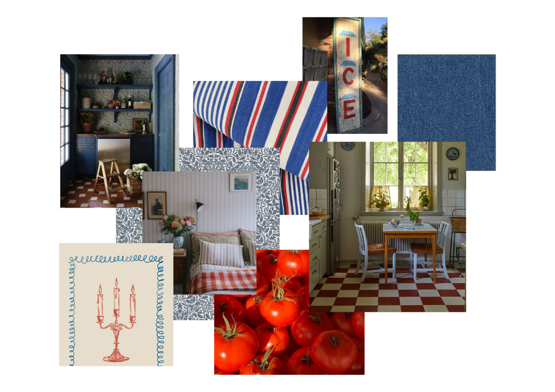
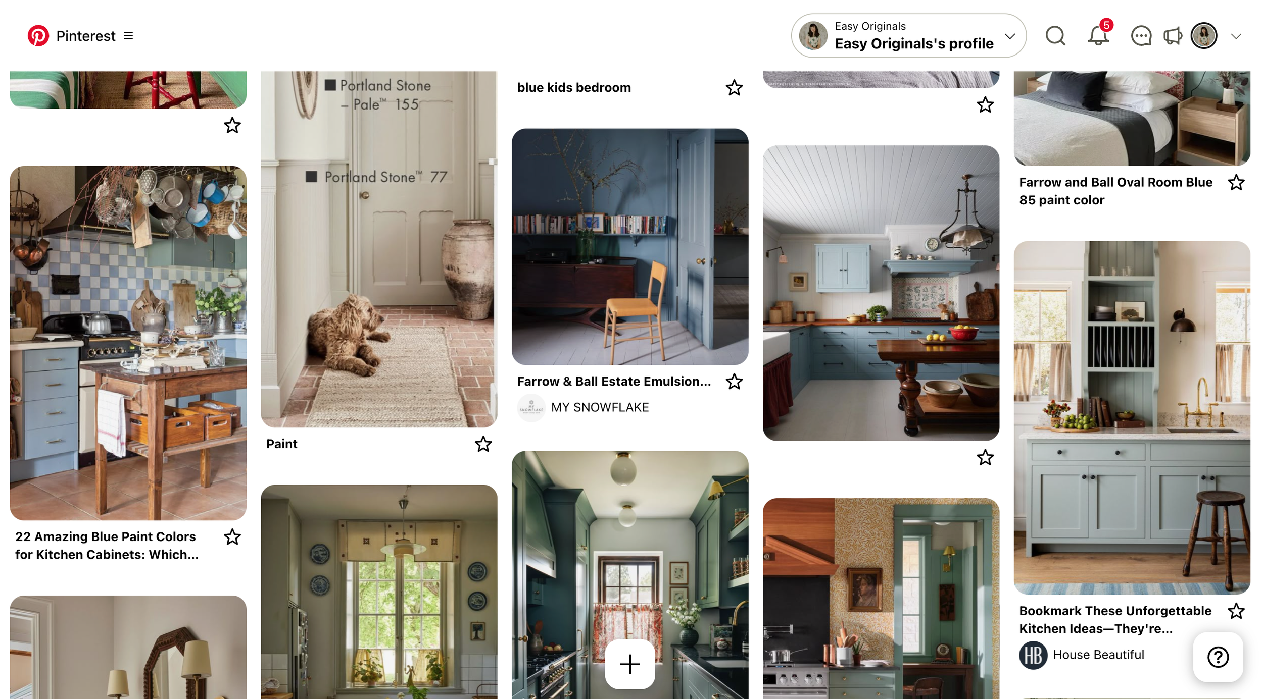
Need Inspiration? Start with Pinterest
If you’re starting from scratch, head to Pinterest and start collecting colour combinations that speak to you. Look beyond just website examples—try art, interior design, packaging, or even nature photography. Try not to judge yourself and this step and just pin and pin and pin anything that speaks to you.
From there, pull out common themes and test combinations that feel fresh but still connected to your brand. The goal is to create something unique and reflective of your business’s personality.
Final Tips
Name your colours in a way that makes sense to you. Instead of "#ACC8E5," try "sky blue", this makes it easier for you ideate with the colours and make notes or sketch ideas out..
Save them in your Squarespace colour themes so they’re easy to reuse site-wide.
Don’t forget mobile! Preview your colour choices on both desktop and mobile to make sure everything stays legible and beautiful.
Creating a thoughtful, intentional colour palette sets the stage for a beautiful and cohesive Squarespace site. If you need help building a custom palette (or a full brand identity), I offer design packages that make the process easy, strategic, and pretty fun honestly.
Need help bringing your brand to life? Book a discovery call or explore my design services.