
Design for Your Audience, Not Your Industry
There’s a quiet trap in branding and website design, especially in service-based industries.
When you start building your brand, it’s tempting to look sideways.
What are other therapists doing? What do other consultants’ websites look like? What feels “professional” in this space?
It feels safe to follow the industry standard.
But safe and effective are not the same thing.
The strongest brands aren’t designed for industry norms.
They’re designed for the people they want to serve.
The Industry Trap
Every industry develops visual patterns over time.
Certain colour palettes feel “appropriate.”
Certain layouts feel “professional.”
Certain phrases start appearing everywhere.
In counselling, that might look like:
muted neutrals
soft gradients
calm, minimal typography
carefully vague language
None of those things are inherently wrong, but when everyone follows the same formula, brands begin to blur together. And when brands blur together, trust becomes generic instead of specific.
What Changes When You Design for the Audience Instead
Audience-first branding starts with a different question: Not: “What should this look like?”, but: “Who is this actually for?” What state of mind are they in? How is there life going? What kind of information would feel comfortable to them? What kind of visuals would make them feel seen?
Design decisions stop being aesthetic preferences and start becoming strategic responses.
That’s when a brand moves from looking “good” to feeling aligned.
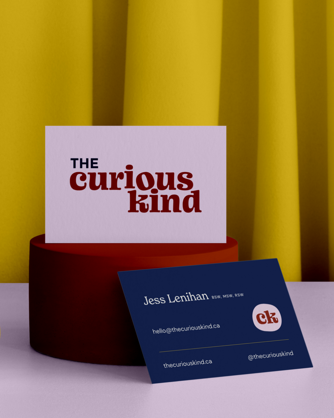
Case Example: Curious Kind
A recent brand project for The Curious Kind is a strong example of this.
Instead of designing for traditional counselling aesthetics, the brand was built for people who have always felt a little different: curious, creative, and not always comfortable in conventional spaces.
We leaned into personality, warmth, and expressiveness, we let the type fit awkwardly together and a little askew. We let hope take center stage. The imperfections were placed intentionally to help the audience feel understood and like they could arrive just as they are.
Case Example: motionally
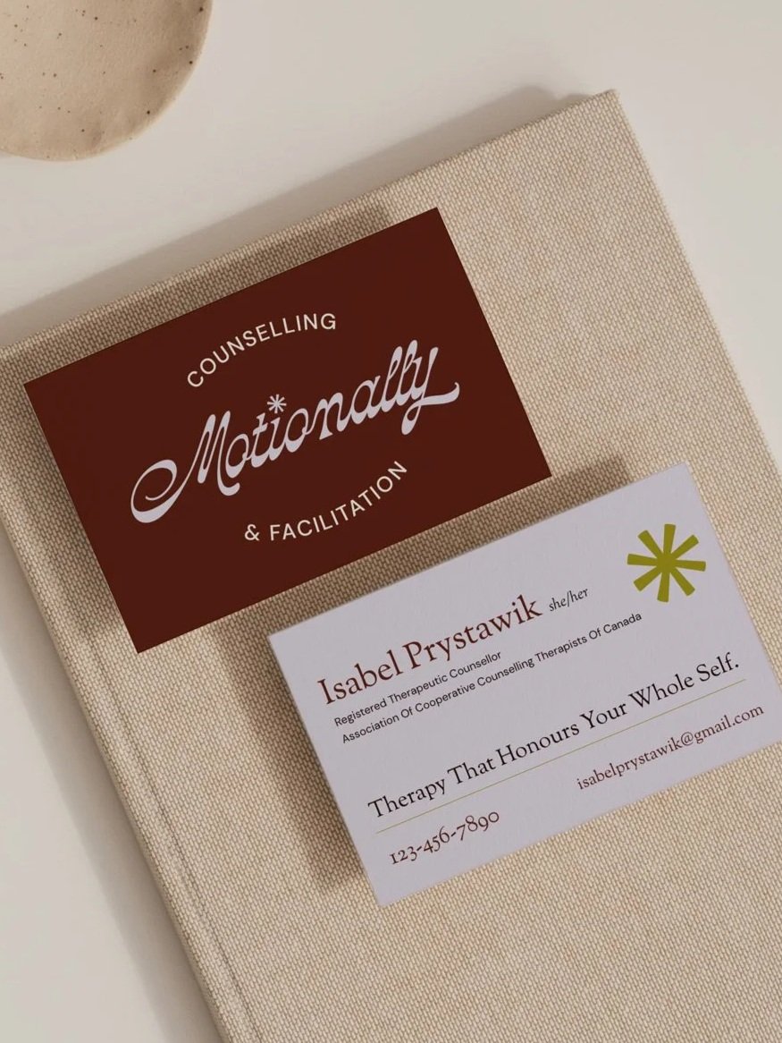
In movement-based therapy, the body is central. The experience needs to feel absolutely judgment-free, a space where you can let down your guard and be yourself.
Defaulting to a static, ultra-clean counselling aesthetic would have contradicted that feeling, and so for Motionally, we embraced a brand that was unequivocally itself.
The design language embraced rhythm, flow, and spaciousness. Layout pacing, visual movement, and tonal warmth were all intentional because the audience and the work engage through embodiment and honesty.
If the brand had followed industry norms, it may have looked “appropriate,” but it would not have attracted the people that were meant for it.
When people feel understood, they don’t need to be convinced.
Designing for your audience does more than make your brand feel unique. It attracts the right clients faster, reduces comparison and second-guessing, strengthens your positioning, and creates emotional resonance that generic branding simply can’t. Audience-first brand positioning reduces friction before a sales conversation even begins.
I’ve worked with therapists and service-based business owners across North America and Europe to clarify their positioning and build brands and websites rooted in audience-first strategy. If you need help finding deeper clarity and a brand that truly speaks to the people you want to serve, you can book a discovery call here. We’ll start with the foundation and build from there.